
Why form elements are necessary?
The most important thing of any website is our form elements. You might be wondering that how form elements are most important. Form elements are used to get input data from website user, therefore forms elements must be beautiful and similar to website theme to make user experience smooth and awesome.
What’s the issue?
Since our form elements are important to get input from user. These elements are come with default design and customizing them is not easy task. Here we explain how to customize radio input and checkbox with jQuery and CSS only.
jQuery made our lots of task easy and developers use CSS to achieve custom design and jQuery to achieve its functionality. But I always prefer to use CSS over jQuery as any execution of script increase RAM usage of browser and make web-page heavy.
Other CSS Solutions
Now our CSS getting strong day by day with pseudo classes. pseudo classes help to create more access element on single html tags. Below is the CSS code to customize form element of radio and checkbox.
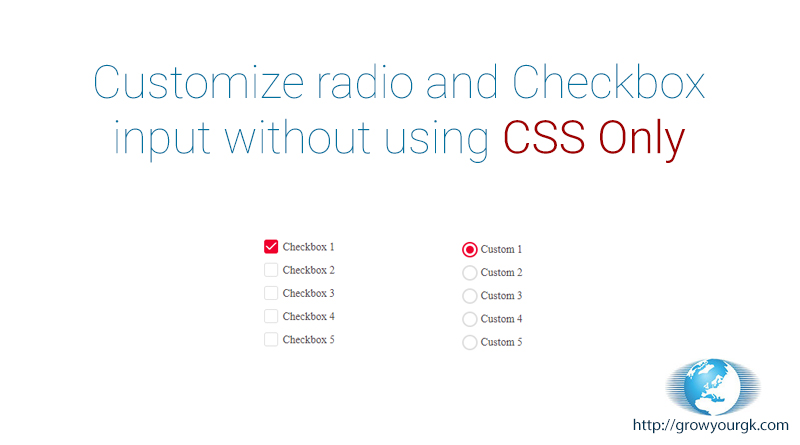
CSS Only Solution
HTML Code
<div>
  <span class="checkbox-input">
    <input name="control-lists" type="checkbox" id="test" value="">
    <label for="test">Custom Text</label>
  </span>
</div>
<div style="padding-bottom:100px;"></div>
<div>
  <span class="radio-input">
    <input name="control-lists" type="radio" checked="checked" id="test-radio" name="tst" value="">
    <label for="test-radio">Custom Text</label>
  </span>
  <span class="radio-input">
    <input name="control-lists" type="radio" id="test-radio1" name="tst" value="">
    <label for="test-radio1">Custom 1</label>
  </span>
</div>
CSS Code
<style>
.checkbox-input,.radio-input {
    position: relative;
    display: inline-block;
    padding-left: 24px;
}
.checkbox-input input[type=checkbox],.radio-input input[type=radio] {
    display: none;
}
.checkbox-input label,.radio-input label {
    font-size: 14px;
    margin: 0;
    line-height: 22px;
    color: #4a4548;
    display: block;
    font-weight: normal;
}
.checkbox-input label:before {
    content: "";
    display: inline-block;
    width: 16px;
    height: 16px;
    margin-right: 10px;
    position: absolute;
    left: 0;
    top: 1px;
    background-color: #fff;
    border: solid 1px #ddd;
    border-radius: 3px;transition:all 0.5s;
}

.checkbox-input input[type=checkbox]:checked + label:before{
    background-color: #d7263d;
    border-color: #d7263d;
}

.checkbox-input input[type=checkbox]:checked + label:after {
    content: "";
    position: absolute;
    top: 3px;
    left: 2px;
    width: 10px;
    height: 4px;
    border: solid 2px transparent;
    border-left-color: #fff;
    border-bottom-color: #fff;
    transform: rotate(-45deg);
    border-radius: 2px;
}

/*********************************************/
.radio-input input[type=radio]:checked + label:before {border-color: #d7263d;}
.radio-input label:before {content: ""; display: inline-block; width: 16px; height: 16px; margin-right: 10px; position: absolute; left: 0; top: 1px; background-color: #fff; border-radius: 50%; border: solid 2px #ddd;}
.radio-input input[type=radio] + label:after{background-color: #d7263d; content: ""; position: absolute; top: 10px; left: 10px; width: 0px; height: 0px; border-radius: 50%; transition:all 0.2s;}
.radio-input input[type=radio]:checked + label:after {width: 10px; height: 10px; top: 6px; left: 5px;}
</style>