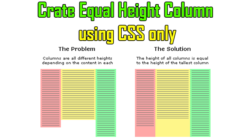
Coloumn structure is very in web layouts. CSS framework become popular because they overcome the issue creating coloums. We just use their classes and coloum is ready to use.
But one issue is not fixed by these framework is have coloum of same height. It becomes very painfull task specially when every coloum has different background color which can show the actual height of div.
Some developers prefer to use table and row structure to achieve this or using own or JS framework. But this makes your html code heavier. Before this I also faced this issue. Therefore posting solution here might help you too.
HTML Code
<div class="container">
  <div class="first-column">
    <ul>
      <li>dfsdf asdfasdfa asdfa</li>
      <li>dfsdf asdfasdfa asdfa</li>
      <li>dfsdf asdfasdfa asdfa</li>
      <li>dfsdf asdfasdfa asdfa</li>
    </ul>
  </div>
  <div class="second-column">
    <ul>
      <li>dfsdf asdfasdfa asdfa</li>
      <li>dfsdf asdfasdfa asdfa</li>
      <li>dfsdf asdfasdfa asdfa</li>
      <li>dfsdf asdfasdfa asdfa</li>
      <li>dfsdf asdfasdfa asdfa</li>
      <li>dfsdf asdfasdfa asdfa</li>
      <li>dfsdf asdfasdfa asdfa</li>
      <li>dfsdf asdfasdfa asdfa</li>
      <li>dfsdf asdfasdfa asdfa</li>
      <li>dfsdf asdfasdfa asdfa</li>
      <li>dfsdf asdfasdfa asdfa</li>
      <li>dfsdf asdfasdfa asdfa</li>
      <li>dfsdf asdfasdfa asdfa</li>
      <li>dfsdf asdfasdfa asdfa</li>
      <li>dfsdf asdfasdfa asdfa</li>
    </ul>
  </div>
</div>
CSS Code
<style type="text/css">
  ul li{list-style-type: disc; list-style-type: none; display: block;}
  .container{width: 600px; background: grey; float: left; overflow: hidden;}
  .first-column{width: 300px; border-left: 1px solid red; float: left; padding-bottom: 500px; margin-bottom: -500px;}
  .second-column{width: 296px; border-left: 1px solid red; float: left; padding-bottom: 500px; margin-bottom: -500px;}
</style>
Here container class is wrapper for both column DIVs. margin-bottom and padding-bottom should have same value and its value will defer according to page content height. Height number would be your assumtion of max height. So always try to use maximum page height.
Example:- if you expect content height could to 2000px maximum then margin and padding value should be 2000px or some more to be on safer side.