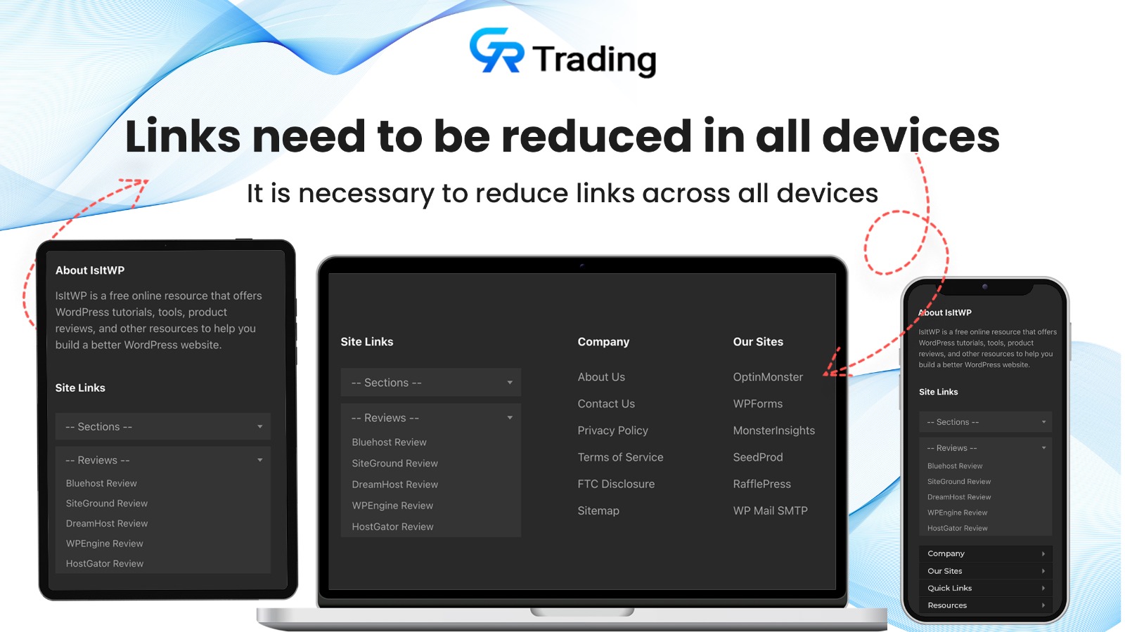
When it comes to designing a website, one of the key considerations is how it will appear on different devices. With the increasing use of mobile devices, it is crucial to ensure that your website is optimized for both desktop and mobile users. One important aspect of this optimization is the banner on your website. In this blog post, we will explore why it is important to change the banner according to desktop and mobile devices, and how you can do it effectively.
Why is it important to change the banner?
First impressions matter, and the banner is often the first thing that visitors see when they land on your website. A well-designed and visually appealing banner can capture their attention and make them stay longer on your site. However, what looks great on a desktop screen may not translate well on a smaller mobile screen. If your banner is not optimized for mobile devices, it can lead to a poor user experience and high bounce rates.
Additionally, the content and layout of your banner may need to be adjusted to accommodate the differences in screen sizes and resolutions between desktop and mobile devices. For example, a banner with multiple images and text may look cluttered and overwhelming on a mobile screen, whereas a simpler and more streamlined design may be more effective.
How can you change the banner effectively?
There are several approaches you can take to change the banner according to desktop and mobile devices:
- Responsive design: This approach involves designing your website in a way that automatically adjusts the layout and content based on the screen size and resolution. With responsive design, your banner will adapt to fit the screen of any device, ensuring a consistent and optimized user experience.
- Mobile-specific banner: Another option is to create a separate banner specifically for mobile devices. This allows you to tailor the design and content to the unique needs and constraints of mobile users. For example, you can prioritize certain elements, simplify the layout, or use different images that are more suitable for smaller screens.
- Dynamic serving: With dynamic serving, your website detects the device accessing it and serves different HTML and CSS based on that device. This allows you to deliver a customized banner experience for each device, ensuring that it looks and functions optimally.
Whichever approach you choose, it is important to test your banner on different devices to ensure that it displays correctly and provides a positive user experience. Regularly monitor and analyze user behavior and engagement metrics to identify any areas for improvement.
In conclusion, changing the banner according to desktop and mobile devices is essential for creating a user-friendly and visually appealing website. By optimizing your banner for different devices, you can enhance the user experience, reduce bounce rates, and increase engagement. Whether you opt for responsive design, a mobile-specific banner, or dynamic serving, make sure to test and analyze the results to continuously improve your website’s performance.
1. Create Blocks Scope To Accept Images in Shopify Admin
{
	"type": "image_picker",
	"id": "mobile_image",
	"label": "Mobile Image"
},
2. Target Slider Block Using Its ID
<style>
@media(max-width:768px){
 #Slide-{{ section.id }}-{{ forloop.index }} .slideshow__media img{visibility:hidden;}
}
#Slide-{{ section.id }}-{{ forloop.index }} .slideshow__media{ background:url({{ block.settings.mobile_image | image_url }}); background-size: cover;}
</style>
Hide Desktop Image Using MediaQuery and Set New Image


